Sunday, October 30, 2011

Boston Delight #2: Now Visiting the Home of the Bean and the Cod – and Staples.

Howdy from Boston. Spending too much time in one part of the country sometime makes me forget great brands in other parts of the country – it’s more true now as Signalwrite Marketing than when I was the creative director of a nationally oriented B2B agency. Arriving in Boston, though, it is hard to ignore Staples.

Staples is the world's largest office products company and the mid-1980s were a key growth era. I remember its more-or-less original slogan, “Yeah, we've got that.”

This slogan was retired in 2003 when Staples hired Martin|Williams in Minneapolis to create a new brand. The old slogan was replaced with “That was easy.” Expanding on that theme, 2005 ads featured a large red push-button marked “easy.” In 2006, Staples' new ad agency, McCann Erickson (creative), and MediaCom (media-buying) won a gold Effie for the effectiveness of their "Easy Button" campaign, which has sold 1.5 million prop Easy buttons.

It’s a brand strategy – reduced in the best possible sense to three words and a visual – that lives long and prospers. In fact, as recently as last week Peter Cohan was blogging on InvestorPlace.com that Staples is a considerably better investment than poor-performing Office Depot.

The Easy Button is one of the great distillations of a wonderful brand solution. Glad I’m in Beantown to be able to blog about it.

Saturday, October 29, 2011

Boston Delight #1: In-Flight Entertainment Now Includes SkyMall Shopping.

Howdy from Boston. First, let me confess that I didn’t know. I didn’t remember this afternoon that if there is a need, no matter how bizarre or obscure, some inventor will fill it. Answer the call of the weird. Create an instant family heirloom. See, a rare page-through of the SkyMall Shopping magazine revealed the Hanukkah Tree Topper unto me:


Here's the perfect way for interfaith families to celebrate both holidays. The menorahment design of the Hanukkah Tree Topper makes a great gift for Hanukkah or Christmas traditions. Available in Silver metallic-coated, textured plastic, with a steel coil for easy, sturdy mounting.


Product development must have been exciting. The fact it’s patented almost made me order it on the spot (right in the middle of Delta Flight #2100 and the unseasonable Northeast snowstorm we were flying in.) The neologistic “menorament” is a good touch too.


Back in 2005, privately held SkyMall was said to be reaching 650 million air passengers every year, with print catalogs on 14 US airlines. It was then America's largest in-flight shopping magazine. It has only gotten bigger. Apparently, its success is due to items like this one…and a lot of undoubted hard work perfecting an excellent “online store.”


In the end Barbara and I couldn’t agree with the snipe across the ad: A must-have for interfaith marriages! We’ve managed without one for 30+ years, with the blessing. We nominated it as a portent of our Fall Boston adventure, though – “Unique, spiritual, beautiful…” according to one product reviewer on the SkyMall Shopping website. Everyone else on Row 15 wondered why we were laughing.


See the kind of marketing stuff you miss by not flying to Boston? Happy Halloween to you and happy Trip-to-Beantown to us. More to come…

Monday, October 24, 2011

I Heard the News Today Oh Boy: Graham Rust Died in Prague; World a Sadder Place.

Graham Rust, founder of the Czech advertising agency Rust, was a great teacher. I discovered this the first time we met. Lesson Number 1 was: Beer in Czech is pivo. Lesson Number 2: Dark in Czech is cerny. Then we just put ‘em together and we were all set to conquer Prague: Cerny pivo.

Sometime just after the fall of the Soviet Union (remember the Soviet Union?), Graham made his agency a member of Dialogue International. So in September of 1994, Barbara and I traveled to Prague for the first-ever Dialogue International managers’ meeting in a former Iron Curtain country. Graham and Jo Rust were our hosts then and on the visits that followed.

We ate a lot, learned how to say three more words in Czech and met wonderfully talented people. The best part of the trip was spending time with Graham and Jo; and staying friends with them for almost 20 years. Buried in a closet somewhere there are photographs of those early meetings. Not digitized. Trust me, though, Graham and I looked younger then. One of us had more hair.

My notes indicate that most of the old Dialogue gang came to Prague that year: Frits Slootweg and Charles de la Rochefoucauld, Jaakko Alanko, Timo Kivi, Gianfranco Vallana (yes, even then). It now seems amazing just how many have maintained their involvement with Dialogue. The managers tabled a next meeting scheduled for Marrakesh in favor of Paris for political reasons that sounds disturbingly contemporary.

Although a Short British Person, he had the heart of an NBA center and the smart of an ad giant. Graham’s death is sad. His life is way more fun. We had a lot of laughs and many great professional moments. Today, my sympathies and those of Barbara and Rachel go out to all the Rusts.

Graham once referred to me as a “Distinguished Friend” of Dialogue International. More important, I am thankful that Graham was a distinguished friend of mine.

Sunday, October 16, 2011

Great New Logo for Portland Art Museum, Just Don’t You Be Parking Here.

I’ve been reading about the Portland Art Museum’s new brand on OregonLive.com and think it a pretty fine job of logo development. I am hardly likely to get out to the Northwest Coast to see for myself, so I’m glad to learn what’s happening out there design-wise.

The new logo was created with Portland design firm Ziba, the same people who designed the Bamboo digital slate for Wacom – that’s another story.

In the article, a couple of sentences concerning the Museum’s research caught my eye:

The public saw the museum as stable and authoritative but not bold or accessible to those who want a museum to challenge conventions. Many also believed the museum did not do enough to connect them to a world increasingly defined by international relationships.

The new logo meets the “bold” and the “international” requirements. So, sayeth D K Row, writing in The Oregonian, the museum’s been deploying its new logo through press and advertising materials, signs and banners since mid-September. And it is far, far more contemporary than the Museum’s older logo. Which you can hurry and see on the Museum website because its website was not the first thing that got changed.

Along with the praise, I note that the contemporary and even trendy new brand might perhaps have been reflected immediately upon introduction on the website…first among many other important tasks. Also, that there is a strong sense of “parking” to this brand look – just Google parking logos and see how many fat P letter forms you find.

Really, I have to say it’s the PAM color choice that got me – don’t find that one on a parking lot sign much. Take a closer look by reading the OregonLive.com article and hurry to eyeball the old brand on the Museum’s website. I bet you anything they’ll be switching that out fast.

Tuesday, October 11, 2011

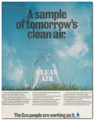
A NatGas Ad from Life Magazine – the Issue with Jane Fonda on the Cover…

Along with noticing the cover photo of Jane Fonda, titled “Busy Rebel,” on the April 23, 1971 issue of Life Rachel unearthed in her old bedroom closet, I found this American Gas Association print ad.

What interests me is that you rarely see an organization like this tabbed as a consistent brand advertiser. Yet the AGA has stayed true to its product, promoting natural gas to this day as “Clean. Efficient. Safe. Energy.” The headline and visual of this ad is just one element of a very long-running advocacy and marketing program.

(It’s in good company, even though some other ads in the issue represent brands that are gone with the wind: American Motors, TWA, Pan Am. There are plenty of stayers. In Life’s four-decade-old pages are advertisements for long-timers Chevrolet, Volvo, Gilbey’s Gin, Jarman Shoes and Kretschmer Wheat Germ among many others.)

The natural gas advertising program has worked well over the years, I think, building recognition and acceptance of natgas as a responsible fuel among consumers particularly. As part of the API ad program, for example, a current energy efficiency ad is here.

These days though, industry ad emphasis has shifted to American job creation in a big way; and to lining natgas up with renewable energy. Tim Sullivan has tied natural gas to renewables and said on the Great Energy Challenge blog that “Natural gas and renewable energy are domestic energy resources in abundant supply throughout the US. They are a secure domestic supply of energy.” So there’s both “natural” and “energy security” in the mix right now.

All good stuff, right? Natural gas wins. Well, no – it’s hard to escape the current demonization of natural gas extraction among certain public and environmental stakeholder groups. As in leave our Marcellus shale alone. This is one more demonstration of “dueling advocacies.” Without a national energy policy, we all end up losers in the 40-year struggle symbolized by this clean-air ad.

BTW: As far as Fonda’s brand is concerned, it has undergone a whole lot of change over four decades. The Life story about her comes 14 months before she shows up in Hanoi, hanging out with the North Vietnamese and sitting on one of the NVA’s antiaircraft guns. Anyone remember that? Talk about demonization.

Saturday, October 08, 2011

A World of Moving Parts (Many): Why Dellschau Feels So Relevant to an Ad Guy.

Until I visited the Menil Collection to see the Walter de Maria exhibition, I had never heard of folk artist Charles A A Dellschau.

Pieces by Prussian-born Dellschau, a saddler and butcher who lived in Houston in the late 1800s and early 1900s are part of another exhibit at the Menil. Dellschau’s paintings and collages of fantastical machines, collected in handcrafted notebooks, were originally salvaged from a dump, and then from a Houston junk shop.

If you have an ounce of curiosity about the modern world, if you are involved with its many moving parts, then you need to see these pieces – not least because his fabulous (in the original sense of the word) drawings are dated 1911. A whole century. Dellschau envisioned a future as very few other people did. But really, those of us who grew up on Jules Verne and Tom Swift recognize these visions.

It’s like that Avery Brooks TV commercial for IBM e-Business software back at the turn of this century – “I was promised flying cars.” Dellschau looks to be one of the original promisers.

For a marketing man who believes that advertising is life and everything else is just details, Dellschau captured the way of life that today we believe is so unbelievably complex. Alright, I skanked that phrase from a t-shirt. Nevertheless we live in a world of many moving parts, from political events to health care to raising kids to going to the moon (although we don’t seem to be headed there any more).

So we come to advertising and marketing. Even in 1911, there were more ways to reach consumers than most of us realize: billboards and transit signage, newspapers, magazines and books with advertising in them, traveling sales people and very well-established catalogues (Sears and Roebuck, "Book of Bargains,” 1894).   

Admittedly, getting sales messages to “captains of industry” was tougher than retail. Business-to-business marketing, including branding, had to wait until Fortune was founded in 1930. People were busy.

Just like today. Looking at the Dellschau pieces…“visionary, folk and eclectic”… shows me at least that he was responding to and addressing the business of life. He was taking in and repurposing cultural memes for communications purposes.

You ought to see these works up close – Dellschau’s a hell of an art director.

NOTE: The Dellschau work here, “Turning Up a Giant Airplane,” is from a private art dealer, Stephen Romano. I use it today because it’s as visual as a photo of these pieces can be. Thanks in advance to Romano. And the same to the Menil Collection always with a special mention to Michelle White, associate curator.