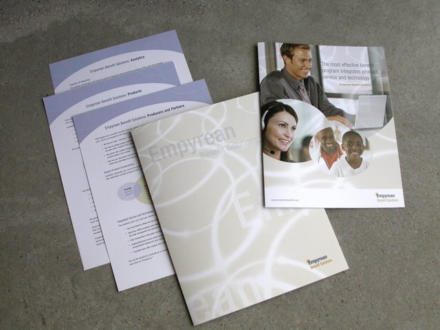
 How do you transfer the vision of combining health benefit “products,” customer services and information technology to paper? You distill the convergence into words and graphics – like this new brochure set for Empyrean Benefit Solutions does.
Kathy Mackey, Empyrean’s Manager of Marketing Communications, wrote, “Thanks for creating the three-dimensional product, service, and technology idea. It has defined our company.”
Prism Design made it all look even better: a graphic concept capitalized on the overlapping nature of Empyrean’s interlocking implementation strategy. It brings an upscale look to the very crowded health benefits marketplace. At the same time, the design’s colors (corporate but warm) and sympathetic photos promote accessibility, whether you’re a broker, an HR manager or an employee.
Mackey continues, “Thank you and Prism Design for creating a perfect representation of Empyrean Benefit Solutions. The process of creating brochureware is not an easy task. We are delighted with the results. I value your experience, professionalism and dedication to the field.”
I worked tight with Empyrean to frame its vision in a discrete set of words. The company’s insistence that contemporary health benefits cannot be delivered cost-effectively except by information technologies is highlighted in these materials.
There’s no longer any real doubt that interactive health communication, patient-centric portals, online doctors’ visits, personalized disease management and wellness programs, individual education and web-enabled CRM will deliver cost and quality transparency to consumers – US healthcare has grown too complicated and too costly.
The Wall Street Journal is co-sponsoring a global forum about healthcare innovation and technology. The write-up is filled with jargon, like “Navigating the Information Age,” “eHealth and the Consumer Driven Movement” and “Patient Centric Approach.”
 With Empyrean, we avoided the buzzwords. The brochureware has to speak to several audiences, including insurance brokers (now called producers), company and association benefits managers and individual consumers. We distilled the company’s message to simplify the presentation and raise its profile.
We also avoided a corporate slogan or tag line. It’s difficult enough to drive a new brand in today’s marketplace without extra baggage. I think the company’s name carries the message.
Simple is better than complex.
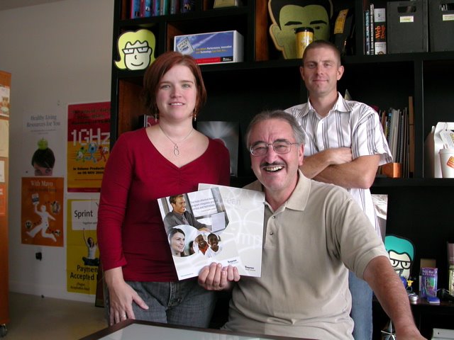
Bottom photo, standing: Anne Stovall, Designer & Terry Teutsch, Chief Designer, Prism Design, Inc. Seated: moi. Appreciation to the Empyrean Benefit Solutions team for perseverance and good words.

3 comments:
Thank you Richard for introducing us to the fine folks at Empyrean. It's been a pleasure working with you again as our copywriter and fellow strategist. You make our job easier. We should do this again soon.
Nice, clean work. You did an excellent job of simplifying a subject that still mystifies and confuses people. I was impressed.
BLAH BLAH BLAH BLAH Look at the good looking guy with the mustache and glasses.
talk to ya this weekend, Doug
Post a Comment