Sunday, October 30, 2011

Boston Delight #2: Now Visiting the Home of the Bean and the Cod – and Staples.

Howdy from Boston. Spending too much time in one part of the country sometime makes me forget great brands in other parts of the country – it’s more true now as Signalwrite Marketing than when I was the creative director of a nationally oriented B2B agency. Arriving in Boston, though, it is hard to ignore Staples.

Staples is the world's largest office products company and the mid-1980s were a key growth era. I remember its more-or-less original slogan, “Yeah, we've got that.”

This slogan was retired in 2003 when Staples hired Martin|Williams in Minneapolis to create a new brand. The old slogan was replaced with “That was easy.” Expanding on that theme, 2005 ads featured a large red push-button marked “easy.” In 2006, Staples' new ad agency, McCann Erickson (creative), and MediaCom (media-buying) won a gold Effie for the effectiveness of their "Easy Button" campaign, which has sold 1.5 million prop Easy buttons.

It’s a brand strategy – reduced in the best possible sense to three words and a visual – that lives long and prospers. In fact, as recently as last week Peter Cohan was blogging on InvestorPlace.com that Staples is a considerably better investment than poor-performing Office Depot.

The Easy Button is one of the great distillations of a wonderful brand solution. Glad I’m in Beantown to be able to blog about it.

Saturday, October 29, 2011

Boston Delight #1: In-Flight Entertainment Now Includes SkyMall Shopping.

Howdy from Boston. First, let me confess that I didn’t know. I didn’t remember this afternoon that if there is a need, no matter how bizarre or obscure, some inventor will fill it. Answer the call of the weird. Create an instant family heirloom. See, a rare page-through of the SkyMall Shopping magazine revealed the Hanukkah Tree Topper unto me:


Here's the perfect way for interfaith families to celebrate both holidays. The menorahment design of the Hanukkah Tree Topper makes a great gift for Hanukkah or Christmas traditions. Available in Silver metallic-coated, textured plastic, with a steel coil for easy, sturdy mounting.


Product development must have been exciting. The fact it’s patented almost made me order it on the spot (right in the middle of Delta Flight #2100 and the unseasonable Northeast snowstorm we were flying in.) The neologistic “menorament” is a good touch too.


Back in 2005, privately held SkyMall was said to be reaching 650 million air passengers every year, with print catalogs on 14 US airlines. It was then America's largest in-flight shopping magazine. It has only gotten bigger. Apparently, its success is due to items like this one…and a lot of undoubted hard work perfecting an excellent “online store.”


In the end Barbara and I couldn’t agree with the snipe across the ad: A must-have for interfaith marriages! We’ve managed without one for 30+ years, with the blessing. We nominated it as a portent of our Fall Boston adventure, though – “Unique, spiritual, beautiful…” according to one product reviewer on the SkyMall Shopping website. Everyone else on Row 15 wondered why we were laughing.


See the kind of marketing stuff you miss by not flying to Boston? Happy Halloween to you and happy Trip-to-Beantown to us. More to come…

Monday, October 24, 2011

I Heard the News Today Oh Boy: Graham Rust Died in Prague; World a Sadder Place.

Graham Rust, founder of the Czech advertising agency Rust, was a great teacher. I discovered this the first time we met. Lesson Number 1 was: Beer in Czech is pivo. Lesson Number 2: Dark in Czech is cerny. Then we just put ‘em together and we were all set to conquer Prague: Cerny pivo.

Sometime just after the fall of the Soviet Union (remember the Soviet Union?), Graham made his agency a member of Dialogue International. So in September of 1994, Barbara and I traveled to Prague for the first-ever Dialogue International managers’ meeting in a former Iron Curtain country. Graham and Jo Rust were our hosts then and on the visits that followed.

We ate a lot, learned how to say three more words in Czech and met wonderfully talented people. The best part of the trip was spending time with Graham and Jo; and staying friends with them for almost 20 years. Buried in a closet somewhere there are photographs of those early meetings. Not digitized. Trust me, though, Graham and I looked younger then. One of us had more hair.

My notes indicate that most of the old Dialogue gang came to Prague that year: Frits Slootweg and Charles de la Rochefoucauld, Jaakko Alanko, Timo Kivi, Gianfranco Vallana (yes, even then). It now seems amazing just how many have maintained their involvement with Dialogue. The managers tabled a next meeting scheduled for Marrakesh in favor of Paris for political reasons that sounds disturbingly contemporary.

Although a Short British Person, he had the heart of an NBA center and the smart of an ad giant. Graham’s death is sad. His life is way more fun. We had a lot of laughs and many great professional moments. Today, my sympathies and those of Barbara and Rachel go out to all the Rusts.

Graham once referred to me as a “Distinguished Friend” of Dialogue International. More important, I am thankful that Graham was a distinguished friend of mine.

Sunday, October 16, 2011

Great New Logo for Portland Art Museum, Just Don’t You Be Parking Here.

I’ve been reading about the Portland Art Museum’s new brand on OregonLive.com and think it a pretty fine job of logo development. I am hardly likely to get out to the Northwest Coast to see for myself, so I’m glad to learn what’s happening out there design-wise.

The new logo was created with Portland design firm Ziba, the same people who designed the Bamboo digital slate for Wacom – that’s another story.

In the article, a couple of sentences concerning the Museum’s research caught my eye:

The public saw the museum as stable and authoritative but not bold or accessible to those who want a museum to challenge conventions. Many also believed the museum did not do enough to connect them to a world increasingly defined by international relationships.

The new logo meets the “bold” and the “international” requirements. So, sayeth D K Row, writing in The Oregonian, the museum’s been deploying its new logo through press and advertising materials, signs and banners since mid-September. And it is far, far more contemporary than the Museum’s older logo. Which you can hurry and see on the Museum website because its website was not the first thing that got changed.

Along with the praise, I note that the contemporary and even trendy new brand might perhaps have been reflected immediately upon introduction on the website…first among many other important tasks. Also, that there is a strong sense of “parking” to this brand look – just Google parking logos and see how many fat P letter forms you find.

Really, I have to say it’s the PAM color choice that got me – don’t find that one on a parking lot sign much. Take a closer look by reading the OregonLive.com article and hurry to eyeball the old brand on the Museum’s website. I bet you anything they’ll be switching that out fast.

Tuesday, October 11, 2011

A NatGas Ad from Life Magazine – the Issue with Jane Fonda on the Cover…

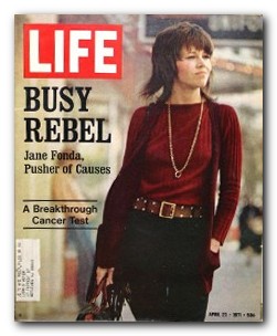
Along with noticing the cover photo of Jane Fonda, titled “Busy Rebel,” on the April 23, 1971 issue of Life Rachel unearthed in her old bedroom closet, I found this American Gas Association print ad.

What interests me is that you rarely see an organization like this tabbed as a consistent brand advertiser. Yet the AGA has stayed true to its product, promoting natural gas to this day as “Clean. Efficient. Safe. Energy.” The headline and visual of this ad is just one element of a very long-running advocacy and marketing program.

(It’s in good company, even though some other ads in the issue represent brands that are gone with the wind: American Motors, TWA, Pan Am. There are plenty of stayers. In Life’s four-decade-old pages are advertisements for long-timers Chevrolet, Volvo, Gilbey’s Gin, Jarman Shoes and Kretschmer Wheat Germ among many others.)

The natural gas advertising program has worked well over the years, I think, building recognition and acceptance of natgas as a responsible fuel among consumers particularly. As part of the API ad program, for example, a current energy efficiency ad is here.

These days though, industry ad emphasis has shifted to American job creation in a big way; and to lining natgas up with renewable energy. Tim Sullivan has tied natural gas to renewables and said on the Great Energy Challenge blog that “Natural gas and renewable energy are domestic energy resources in abundant supply throughout the US. They are a secure domestic supply of energy.” So there’s both “natural” and “energy security” in the mix right now.

All good stuff, right? Natural gas wins. Well, no – it’s hard to escape the current demonization of natural gas extraction among certain public and environmental stakeholder groups. As in leave our Marcellus shale alone. This is one more demonstration of “dueling advocacies.” Without a national energy policy, we all end up losers in the 40-year struggle symbolized by this clean-air ad.

BTW: As far as Fonda’s brand is concerned, it has undergone a whole lot of change over four decades. The Life story about her comes 14 months before she shows up in Hanoi, hanging out with the North Vietnamese and sitting on one of the NVA’s antiaircraft guns. Anyone remember that? Talk about demonization.

Saturday, October 08, 2011

A World of Moving Parts (Many): Why Dellschau Feels So Relevant to an Ad Guy.

Until I visited the Menil Collection to see the Walter de Maria exhibition, I had never heard of folk artist Charles A A Dellschau.

Pieces by Prussian-born Dellschau, a saddler and butcher who lived in Houston in the late 1800s and early 1900s are part of another exhibit at the Menil. Dellschau’s paintings and collages of fantastical machines, collected in handcrafted notebooks, were originally salvaged from a dump, and then from a Houston junk shop.

If you have an ounce of curiosity about the modern world, if you are involved with its many moving parts, then you need to see these pieces – not least because his fabulous (in the original sense of the word) drawings are dated 1911. A whole century. Dellschau envisioned a future as very few other people did. But really, those of us who grew up on Jules Verne and Tom Swift recognize these visions.

It’s like that Avery Brooks TV commercial for IBM e-Business software back at the turn of this century – “I was promised flying cars.” Dellschau looks to be one of the original promisers.

For a marketing man who believes that advertising is life and everything else is just details, Dellschau captured the way of life that today we believe is so unbelievably complex. Alright, I skanked that phrase from a t-shirt. Nevertheless we live in a world of many moving parts, from political events to health care to raising kids to going to the moon (although we don’t seem to be headed there any more).

So we come to advertising and marketing. Even in 1911, there were more ways to reach consumers than most of us realize: billboards and transit signage, newspapers, magazines and books with advertising in them, traveling sales people and very well-established catalogues (Sears and Roebuck, "Book of Bargains,” 1894).   

Admittedly, getting sales messages to “captains of industry” was tougher than retail. Business-to-business marketing, including branding, had to wait until Fortune was founded in 1930. People were busy.

Just like today. Looking at the Dellschau pieces…“visionary, folk and eclectic”… shows me at least that he was responding to and addressing the business of life. He was taking in and repurposing cultural memes for communications purposes.

You ought to see these works up close – Dellschau’s a hell of an art director.

NOTE: The Dellschau work here, “Turning Up a Giant Airplane,” is from a private art dealer, Stephen Romano. I use it today because it’s as visual as a photo of these pieces can be. Thanks in advance to Romano. And the same to the Menil Collection always with a special mention to Michelle White, associate curator.

Monday, September 26, 2011

Pea-Finding Maximizers Improve Your Odds: SEO Tricks You Can Use Right Now.

One problem I face creating a new website is in the buzzy realm of SEO – Search Engine Optimization, right? Maybe I am branding the company. Maybe I’m crafting content for a new or revised site. In all cases, it is now a challenge – and good client service – to get the new site’s page ranking higher on Google and other search engines.

How to find and use the right search terms in copy, if you’re a marketer or copywriter? How to build them into your website, if you’re an in-house graphic designer or a outsource coder?

These days we pay more attention because the Internet’s a shell game. The complexity and competition of the worldwide web are the shells; your website’s optimized efficiency is the pea. Discover the pea and you win more…eyeballs. But the pea is elusive. You need more than guesswork. You need pea-finding maximizers.

I always try to find and use a set of current practices when creating a site. (“Current” is important because the game changes all the time.)

That’s just what I’ve done over the past few days. I completed a website’s content with the extra help of 11 simple but effective tricks. I learned – or re-learned – them at a Search Engine Optimization lunch seminar last week. The good people* at CITOC brought Toronto-based Stuart Crawford, President and Chief Marketing Officer at Ulistic, to lead the instruction.

Here’re my current pea-finding maximizers.

1. Start with a tight-and-right marketing plan. Every great website is based on one. Getting it nailed is harder than it looks. And it’s also where you evaluate key words and search terms.

I sharpen this by building in brand-related words, too – important when the client’s marcomms will help push customers and prospects to the new site: not just “oilfield sand screens,” for example, but “open hole expandable sand screens.”

2.  Use text and lots of it. (or Department of Music to a Copywriter’s Ears). Google searches text. The more of it there is on a website, the greater the opportunity for search programs to spot your key words.

3.  Optimize for where you do business. Adjust your website(s) to relate to prospects locally, regionally, nationally and internationally. All of these if you do business globally.

Searches that are effective in Hong Kong or Heidelberg may not work as well in Houston and vice versa – key phrases may be completely different from region to region. Example: “combat boots” in the US, “military boots” in the UK.

4.  Search engines work even better with “current events.” The fresher the news the better off your website is, search engine-wise. Frequency of fresh news is also a strong attractor. Which leads to…

5.  Easy updating is crucial. However you can do it, you need to be able to change up news, events and other elements on your site quickly and easily. Whether you’re the one, or you have an outside resource do it, it has to be fast and simple. Make it so.

Okay – keep a clock on your IT department, your outside vendor or freelancer. The sooner the news release is posted, the sooner search engines can get to work. No, I don’t mean it has to be done this New York minute; “timely” is the right measurement here.

6.  Enjoy more wham! from your website title tag. If you can transmit a key word or key term in the website title, do it. Putting “Jones and Company” is way less effective than “Cheap Diamond Rings ׀ Jones and Company.”

Or look at Signalwrite.com where the upper left title tag starts with “Richard Laurence Baron. Then comes “Signalwrite” followed by “Marketing Copywriter Houston.” My brand is built on my three-part name. I want people to search for – and find – me. Thank you to Brian Bearden and Zephyr Salvo for constructing it this way.

7.  Put a Convert Button on every page. Do not lose the chance to call-to-action right where your readers may be stopping.

8.  Use PR releases for backlink to your site. More frequent publicity releases, even for in-company celebrations, can boost visits to your website…remember to put hotlinks into your PR every time.

9.  Then get OPWs to link to yours. That’s Other People’s Websites. Your partners, vendors, customers – either from some social media site(s) or their own websites…this will drive traffic to yours also. Don’t forget to return the favor.

10. Take massive advantage of Google Places. B2B or Retail, especially Retail – put up a separate Google Places listing for each store, office and facility. Don’t forget to check current address details.

11. Test and measure, test and measure. Keep using Google Analytics and other options to see how your newly effectorized website is doing. SEO needs some care and feeding, you just want to know what, where and when.

These are nowhere near all the SEO rules, tips and tricks. And unless your life is spent online, that means another kind of shell game for you to confront. How do you pick the right SEO person or firm to help you with this?

Maybe “test and measure” applies here, too. C’mon, can I get some opinions on this from real social media experts?

*Nota Bene (which means “note well”): Signalwrite-sized thanks with loud tropical shirts on to Citoc’s BJ Farmer and his team for timely and tasty learning; to Ulistic’s Crawford, taking advantage of Houston weather before snow-flying time comes to eastern Canada; and Hieronymus Bosch (c. 1450-1516) who shows that finding the pea has been much harder than it looks for centuries. From Wikimedia Commons.

Saturday, September 24, 2011

National Punctuation Day Needs More Than Ad Errors. Try Victor Borge.

There’s a movement dedicated to helping us punctuate precisely . On the National Punctuation Day® website, discover a “celebration of the lowly comma, correctly used quotation marks…and the ever mysterious ellipsis.”

Entire books are devoted to the subject – the best known probably Eats, Shoots & Leaves by Lynne Truss. Great websites cover the wince-making world of mispunctuation. And there are photos of screwed-up signs, billboards, ads and packaging by the dozens.

E.g., I’m particularly grateful for today’s Signalwriter post visual first posted by Sarah Long, English-language writer at GBG Copywriting in Gothenburg, Sweden. Particularly – because it’s one of several portraying a mistake in the old Stella Artois “Perfection has its price” ad campaign. And because client Cameron Wallace of Helix ESG loves Stella.

This post’s for you, Cameron. But I also wanted to draw attention to the “Holiday Happiness” page of Bar Business – the editors present 10 or 12 ideas for bars and pubs to use for letting their customers have some fun and make more money for the month ahead. Featured in the August issue there’s a Virgin Mary Day (promoting non-alcoholic cocktails on 9/8) for example, and a National Punch Day (9/20, great for specially priced but enormous portions of alcoholic punch).

For 9/24, National Punctuation Day, the magazine suggests:

On this day you can have your bar staff annunciate the punctuation marks required by their conversational sentences. If they pause they say comma. If they shout they say exclamation point. And when they ask a customer, “what can I get you,” they say question mark. Get ready for a weird day.

I’ll say exclamation point. Do you think bartenders and wait staffers get paid enough for this question mark. In any case comma it apostrophe s a great reminder of a different phonetic punctuation sketch invented by pianist hyphen comedian Victor Borge period So to celebrate comma watch this routine on YouTube period

Remember it apostrophe s National Punctuation Day long hyphen proofread your stuff period

Wednesday, September 21, 2011

Happy Trails, Hapless Hotmail – I Can Change More Easily than You.

David Hansen posted a card from someecards.com that is aimed at Facebook users but will serve for me to talk (briefly) about Hotmail.

I am appalled that the free service that I am in no way obligated to use keeps making changes that mildly inconvenience me.

When I returned to the computer yesterday afternoon, I discovered that my Hotmail account had been seriously corrupted. After more than a decade with Hotmail, the MSN service got hacked. I have no access at all to MSN Live or Hotmail.

Not only no access - but a new account I created to try fixing the problem was also immediately blocked. I can't "post a problem" to Windows Live forums because they require a sign-in; the passwords don't work. I spent almost two hours on the telephone with technical service people.

The toll-free number for MSN billing support, by the way, is 866-672-4551; even though it wasn’t his job, “Ed” helped out as much as he could. In the end, his assistance didn’t get me back into the account(s). He passed me on to MSN Product Technical Support at 866-234-6020; here, both “Joey” and “Ashwin” tried their best, I guess.

By 10.30PM, it had become a circular joke. To get anywhere, I had to log in. Every new password the tech-sup guys gave me sent me to a screen that told me my “access was blocked” and led me to try starting again. Basically, they threw up their hands at the end of the Skype conversations.

Many Microsoft and Hotmail online support forums address the blocked access issue…same problem as mine. Some resolved it. Some (according to my reading) never did. After Hotmailing for a decade and more, it's past time to move on. Hey, it was – mostly – FREE!

I can change. I’m working on that right now with a little help from a lot of colleagues and clients. Gmail is the choice here; and it’s been getting great reviews like here for years:

Gmail, our TopTenREVIEWS Gold Award winner, includes excellent spam protection, phishing warnings and virus scanning; ultimate organization, conversation view, POP3 access and 8 GB of inbox storage that continues to grow every day.

In fact, you can find me on Google+ and Gmail both. Now that Google+ is “open to the public,” it’s probably the solution for me. I choose to embrace the transition. I close by paraphrasing the great Evelyn Waugh, “Change is the only evidence of life online.”

Friday, September 09, 2011

M D Anderson Rebranding Program’s Great Story – Behind the AMA Firewall.

Am I committing a faux pas? Or delivering a service?

I ask because Mary M Flory wrote a fine, descriptive article in the just-arrived issue of Marketing Health Services. Titled, “Painting the Town Red,” it’s about the M D Anderson Cancer Center rebrand. And for the moment, it’s for American Marketing Association members only – stashed behind the MarketingPower.com firewall.

This copyrighted article features the institution’s Associate Vice President of Marketing Alicia Jansen – that’s her in the publication’s photograph – and details how the institution’s stakeholder team pulled off its “comprehensive brand overhaul.”

(On a smacking-my-forehead note, I missed the chance to scoop Flory because Jansen presented the story, in person, at our AMAHouston Healthcare SIG event in June. And I did NOT blog about it.)

I am not going to reprise the article, nor take away from the hard work of brand reviewing and rebranding conducted by the MD Anderson Cancer Center team. But I think it’s worth bringing some element out from behind the firewall – the five challenges that MD Anderson had to identify before the brand could be “fixed.” Directly quoting from the Flory piece, they were:

1. Brand interpretation: MD Anderson did not have an understanding of how its brand promise was being perceived across its many stakeholders.

2. Brand asset performance: MD Anderson’s previous logo and other brand assets did not differentiate the organization nor communicate its mission as strongly. In addition, the assets were dated, fading into the current communications environment.

3. Brand voice: With the volume of communications being disseminated from the organization, MD Anderson noticed a dilution of the brand. This dilution was due, in part, to the lack of a unified design and messaging system.

4. Brand growth: Due to growth in the past 10 years and the mission to be a global leader in cancer care, several national and global relationships were established and a brand architecture and management system had not been implemented to unite or tie the strategy together.

5. Brand management: MD Anderson used a cross-functional approach to communicating its brand and did not have a strategy to manage its current approach, much less future growth.

It’s classic “Find the problems” stuff. (Gotta find ‘em before you can fix ‘em.) Well…your institution or company may be facing the need to build a stronger brand voice. So you next steps are: join the American Marketing Association, get behind its firewall and read the article. It’s a fine first guide to rebranding.

Me? I’m grateful to AMAHouston and Jansen for the chance to have heard all the newest parts of the story first-hand. (I did blog about the MD Anderson ad campaign here 18 months back.) Even more, thanks to Flory, Managing Editor of Magazines for the American Marketing Association, for the telling-in-print.

Friday, August 19, 2011

When Your City Rebrands (like Ames, IA), Don't Take Umbrage. Take Advantage.


I wouldn't have paid attention to the Ames Patch post by Jessica Miller if I hadn't stopped in this Iowa college city on Monday for supper . (Sure enough, we pulled into a parking spot opposite Olde Main Brewing Company to see Michelle Bachmann for President 2012 campaign posters in the storefront windows.)

It turns out that the City of Ames hired Des Moines's PUSH Branding & Design to revamp the existing multi-green-colored logo. The experienced agency appears to have executed its usual job of creating a completely new look and approach for the city of 60,000....that's the red version on the left.

The City Council has asked the citizens for their opinions in a posting to the Ames municipal website, where you can see other versions of the new brand, as well as a proposed theme line: Heartland's Leading Edge.

These variations present Ames's biggest challenge – change. Asking citizens to comment, well, I realize it's right out of the “Big Book of City Council Things To Do.” But perhaps they shouldn't have.

Example: one commenter to Miller's blog post notes:

It's the old “If it ain't broke don't fix it!” The current logo has more impact, straight forward, bold, and fully understandable. Why spend thousands of whose money?? [sic] on something abstract that only a few understand. I used to design logos for local small businesses and never charged a dime. The same designers may be found here in Ames that would just take pride and not laugh all the way to the bank. Also, not appreciative of the costs involved in changing letter heads and other signage. What a waste for Ames.

I do not quote “Jo” in full to be patronizing. Having reviewed a couple of dozen city-rebrand stories over the past several years, though, I suggest that these posted comments encompass most of the complaints I've seen in other civic branding challenges – nothing wrong with the existing logo; new logo costs “thousands” of taxpayers' money; design too abstract/obscure/doesn't fit the civic persona; why go out of town for a design firm...and so on.

Yet whether the new brand proposed by PUSH is awful or awesome, look back a couple of paragraphs for that magic word, “change.” Properly, the City Council of Ames has decided that the 15-year-old green logo (on the right) is...dated. It is broken. It's the Council's job to fix that problem – without even reading the city charter, I am as certain as the Straw Poll it's charged with promoting economic and cultural growth. A new brand of any flavor ought to push in that direction.

It's also the City Council's job to spend money. Not foolishly, not wastefully...but productively. Generally, we pay taxes so that our governments can get on with the job of providing for life, liberty and the pursuit of happiness...by spending that tax revenue on a wide variety of projects and services.

It's a recurring fallacy that governments should not spend our money...or refuse to make decisions that cause change. Transforming the Ames logo mark to RED from GREEN is, I suspect, a really big one.

I leave aside the observation that someone might design logos for businesses and never charge a dime. Any good worker is worthy of his hire. Without knowing the parameters of the RFP, maybe PUSH Design could fulfill the terms and Ames agencies could not. Or PUSH brought a level of branding experience to this project that local outfits couldn't match.

So take another look at the Des Moines design firm and decide for yourself if it has the chops for the Ames rebrand project.

Feel free to weigh in on the Ames City Council request for feedback by emailing sgwiasda@city.ames.ia.us – today's the last day the Council will accept your thoughts; or comment at the bottom of the Miller blog post.

I'll say this: the proposed Heartland's Leading Edge line (leave out the article, please) makes good sense when I read how much research and development, agricultural and otherwise, goes on around this 60,000-people city. And as with every brand change, the more you promote it, advertise it and take advantage of it, the better off you'll be.

First, though – go with it!

Saturday, August 13, 2011

How Rachel and Alison Help Make Up for Missing International Pickle Week.

Keeping an advertising blog while traveling is highlighted by happenstance. Today's post is powered by the appearance of a jar of Gedney State Fair Baby Baby Dills in our rooms here in New Prague. I had forgotten that Minnesota is so much of a “pickle state.” Wisconsin gets cranberries; the Land of 10,000 Lakes gets kosher dills.

Among many other varieties and circumstances. You can eat your way through the State Fair on pickles as Baking Junkie blogger Aimee demonstrates, “...a Pickle Dog. A pickle spear wrapped in cream cheese and pastrami. Absolutely fabulous and just like eating a giant pickle roll-up (another typically midwestern appetizer)”

International Pickle Week was last May, according to Minnesota Monthly writer Marie Flanagan, who also offered the classic Deep Fried Pickle Recipe...from Gedney. Which is why it's a pleasure to note that constant exploration and food purchasing by Rachel Baron and Alison Bond is such a great payoff for a marketing blogger like Signalwriter.

Not only didn't I remember the pretty darn famous Gedney Pickle Company from up here, but I didn't know that the...pickle giant...had been marketing a perfect peck of pickle products for this part of the world: its “State Fair” line-up.

Briefly, the first Gedney pickle factory opened in Minneapolis in 1881. A hundred or so years later, as a Minnesota State Fair sponsor, the company began packing and marketing top-prize-winning pickle recipes from ribbon winners there in 1991 with the Kosher Dills of Genevieve Spano and the Bread & Butter Pickles from Nita Schemmel. (The present jar of Baby Baby Dills is a prize-winner from Kathy Earnest, Lindstrom, MN.) And the locally famous jingle, “Get me a Gedney, it's the Minnesota pickle,” created by freelancer Sandy Buckholtz, grabbed hold up here.

Gedney has grown far beyond selling pickles from the back of horse-drawn wagons – it expanded by buying brands like Cain's to capture New England; and produces pickles for both Del Monte and Target's Archer Farms brand lines. Most important: Gedney's State Fair line maintains a resolute local focus, the “pickles here” of grocery marketing and promotion. For a company like this, thinking local continues to pay off, whether local equals Massachusetts or Minnesota.

Travel broadens one's view of advertising and promotion, alongside regional foods and events. Good to pick up a little fresh knowledge (and some pickles) while on the road. We'll be trying out these at the Slavik family reunion. Maybe I can tell you how Kathy's recipe has turned out.

PS: You betcha – that's Kathy right there on the label.

Thursday, August 11, 2011

Wichita Ale Tales: The Brewer Polishes Old Snortin' Norton.


In Wichita, Kansas, Dan Norton is the Head Brewer at River City Brewing Company. We've been stopping here every time Barbara and I drive to Minnesota...for years. This time, though, Maria (our server) offered something different: Old Snortin' Norton, a beer created by the brewer to celebrate his 1,000th beer. It is...fine. Said the same in an email to Norton; asked for details. And you know, sometimes you just can't beat other people's stories. Here's at least three – from the brewer's mouth.

Thank you for the nice comments on my 1,000th batch. A lot of times for commemorative brews, I’ll brew something very big, add some crazy ingredients, age it in some kind of barrel with tons of dry hops, push the limits a little.

I have been researching my family history quite a bit this year, and I thought for my 1,000th batch that I’d keep it simple with a straightforward style, but a style that is “all there” when it comes to flavor. My grandpa Bob taught me how to homebrew when I was 18 and stumbled upon his batch of Pale Ale that he brewed in the basement fridge.

Grandpa Bob was a strong-willed, some say stubborn guy that loved his family and grandkids very much! He was an engineer for the Grand Trunk Railroad in Battle Creek, Michigan, and was known at every bar that was on his route home from work, as Old Snortin’ Norton, or sometimes “Snort” for short. He was also on the USS Reid in Pearl Harbor, and when you look at records online of who was on that ship, it lists the crew with a column for nicknames. Sure enough, it says Snortin’ Norton next to my grandpa!

I never got to sit at a brewery with Old Snortin’ since he passed when I was 20, so I wanted to honor him with this beer, and every glass I drink of it, I raise it up for my grandpa!

Since we all hail from England, I decided on an English Old Ale. My version is on the dark end of the spectrum for this style, but within range. The 7.7% alcohol Is also towards the top range, but that’s what I wanted. I used Maris Otter as my base malt for this beer, which adds a little more grainy-biscuit flavor and a little more body than our standard 2-row Pale Malt.  Some Caramel 80, a mid-range Caramel malt adds a little toasted toffee-like flavor, Chocolate Malt and Black Malt add to the complexity by adding their dark color and sweet roast flavor.

But hold it to the light and the deep amber color of the Caramel malt will shine a nice garnet color. East Kent Goldings, and Fuggle Hops add their spicy English Hop character, then I fermented with a English yeast strain, which adds that signature flavor. All in all, I think it turned out really good. It will age nicely, so I am stowing two kegs away for a rainy day, possibly for our 18th Anniversary Party (which is a can’t-miss event!)

If you and your wife were to only have one day a year to stop into the brewery the first Saturday in March would be it!  We pull out all the stops and release some really nice beers that day.  Plus, they are all $2.50, you can't beat that!

Cheers to you and your exploration of good beer, Richard.

Companies, brands, products (such as RCBC's handmade beers) – they're all burnished by good stories. Big-time thanks, Dan Norton, for sharing these. The photo of the brew pub (top) is from the Wichita Library, thanks very much. In the smaller photo, the glass on the right contained the Old Snortin' Norton. Barbara's Emerald City Stout – same brewer – is on the left.