 Advertising that breaks pattern is going to stand out.
 In some industries, there’s a common pattern in most ads. In the consulting segment, you’ll see ads that feature a carefully balanced group of people, standing or sitting seriously around a big conference table. Young people having fun, fun, fun: that’s either cell phones or MP3 players…sometimes both.
It’s called “the rig in the sunset” in the upstream oil and gas sector: a big, beautiful four-color photograph of a drilling rig or production platform at sunrise or sunset. A little (or a lot of) copy underneath it. The company logo is usually stashed at the bottom. Everybody has done it at one time or another. But the ads you remember are the ones that don’t have that assembly-line look.
For a brand new company, Premium Drilling, we broke the mold. That’s me and Prism Design. We looked at existing advertising for drilling companies and presented our client with several more-or-less utterly different options. I credit Premium Drilling with selecting the differentest of the lot.
This new company got itself a running start, with every new jack-up rig a-building in Singapore already booked. Its two ads were specifically designed to run as a pair, with an initial appearance in that epitome of an oilfield annual, the Mobile Rig Register.
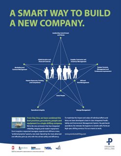
So the headline play is purposeful and highlights a company that decided how it wanted to operate from its inception: not only new but smart with it.
Much more important is the ads’ design. Here’s a very graphic approach to telling two stories in a unified format. Against its Premium Blue background, “Smart Way” uses a star-configured constellation of bullet points to emphasize the building blocks of the new company’s organizing principles, architected against silhouettes of some of its employees.
“New Way” organizes different bullet points – about the rigs’ technical features – as contributing factors, with a silhouette of one drill rig as its center. The designer integrates headlines, visuals, copy, even participating organizations, into cohesive wholes which deliver a different look to a market niche that has way too many photos of drill rigs as its main ad visuals.
My appreciation to Premium Drilling for allowing us to work with it on its advertising. And to my long-time colleagues at Prism, my thanks for letting me help create these atypical and vivid corporate ads.
For the record: Susan Reeves, Creative Director; Terry Teutsch, Designer/Art Director; Richard Laurence Baron, Copywriter.

1 comment:
Very Nice Work! Kudos to both you and Prism.
Post a Comment